By Charis Loke and Dhiren Shingadia from the MA Visual Sociology 20/21
What do we not notice around us, but rely on? Who gets to take these things for granted? What happens when infrastructures break and surface?
For the Social Research for Public Engagement module, students employed visual and inventive methods in sociological research projects related to the theme of Infrastructure—the underlying matter (and immaterial structures) upon which other matter moves and which make things work. They then translated their findings into pieces for public exhibition. Charis Loke and Dhiren Shingadia, both MA Visual Sociology students, share the outcome of their projects and respond to each other’s work.
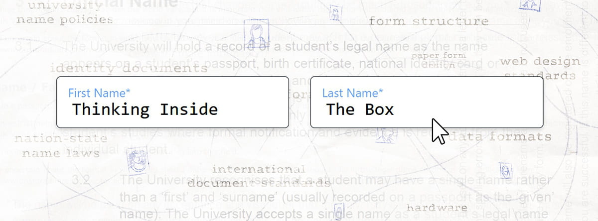
Thinking Inside The Box: Forms as Infrastructures For Personal Names by Charis Loke En-Ping

Medium: Web form/ interactive multimodal webpage with sound, images, chatbots, text
Abstract: Taking a recurring personal trouble as a point for exploration, I ask: how do forms shape names while being shaped by naming conventions and other infrastructures for names? The forms in this page do not do what forms are meant to do—collect data. Instead they present narratives and insights gleaned from interviews with students and alumni of UK universities, policy documents, university web forms, and my own experience of correcting my name order in the Goldsmiths Student Records system. What might we learn by attending more closely to what forms do? What do we take for granted about naming conventions and the infrastructures they’re built upon?
Infrastructures that underlie the aspirations of British South Asians by Dhiren Shingadia

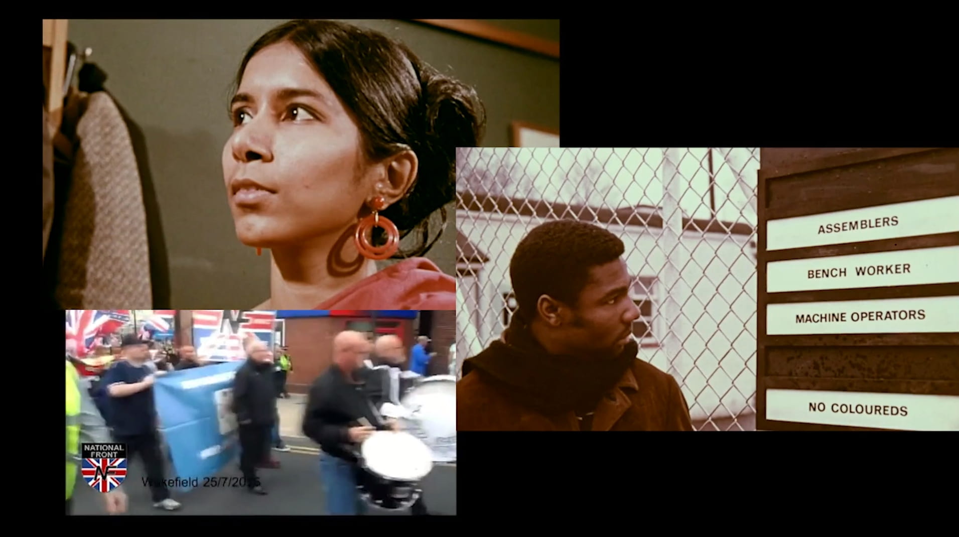
Medium: Moving image collage with sound
Abstract: Today, Hindu and Sikh British South Asians are recognised as aspirational members of British society, with a strong work ethic. Many descend from parents who migrated to the UK as post-colonial migrants, invited by the British government, or as asylum seekers who were expelled from Uganda by Idi Amin in 1972. Their aspirations have piqued political interest over recent years as they underlie a shift in their voting patterns. Specifically, a departure from how their parents and grandparents voted when they migrated to the UK. Through my research, I wanted to begin to understand what underlined their aspirations? What critical infrastructures emboldened them and how were they interconnected?
A Conversation, Through Google Docs
Charis: In the Visual Sociology MA, we’re encouraged to learn from how artists have translated topics in their work. I’ve found this to expand my thinking a fair bit because most of my influences had been from outside the contemporary Anglosphere art world. Were you drawing on specific influences when putting your moving image together?
Dhiren: Absolutely, yes. I initially took inspiration from Steve McQueen’s retrospective at the Tate; I wanted to create a video installation using multiple screens and projectors to facilitate the translation of multiple messages simultaneously. As the exhibition moved online, I had to change my approach. Filming became challenging so I decided to use publicly-generated content and archival material. Additionally, I needed to fit my work into a single screen whilst staying true to my original concept; therefore, I created a moving image collage, inspired by De’Anne Crooks’ Great-ish.
C: I think the moving image collage format is an effective way to allude to the multiple overlapping infrastructures which underlie and shape aspirations. You made the choice to overlay music instead of, say, interview audio or audio from the archival footage. Why?
D: I believed the audio from my research was too literal. People are bombarded by facts and opinions today. It was an engagement strategy choice to leave them out and build emotion differently. Additionally, user-generated content and archival footage were purely selected for what they showed. Some clips contained good discussions, yet leaving them in the translation would have affected the tempo of engagement. The rapid sequencing of clips and high tempo audio provided a way to keep people alert and attentive.
Your translation contains an element of gamification. One has to figure out what steps to take. Was gameplay something you proactively considered or did it find its way into your translation passively?
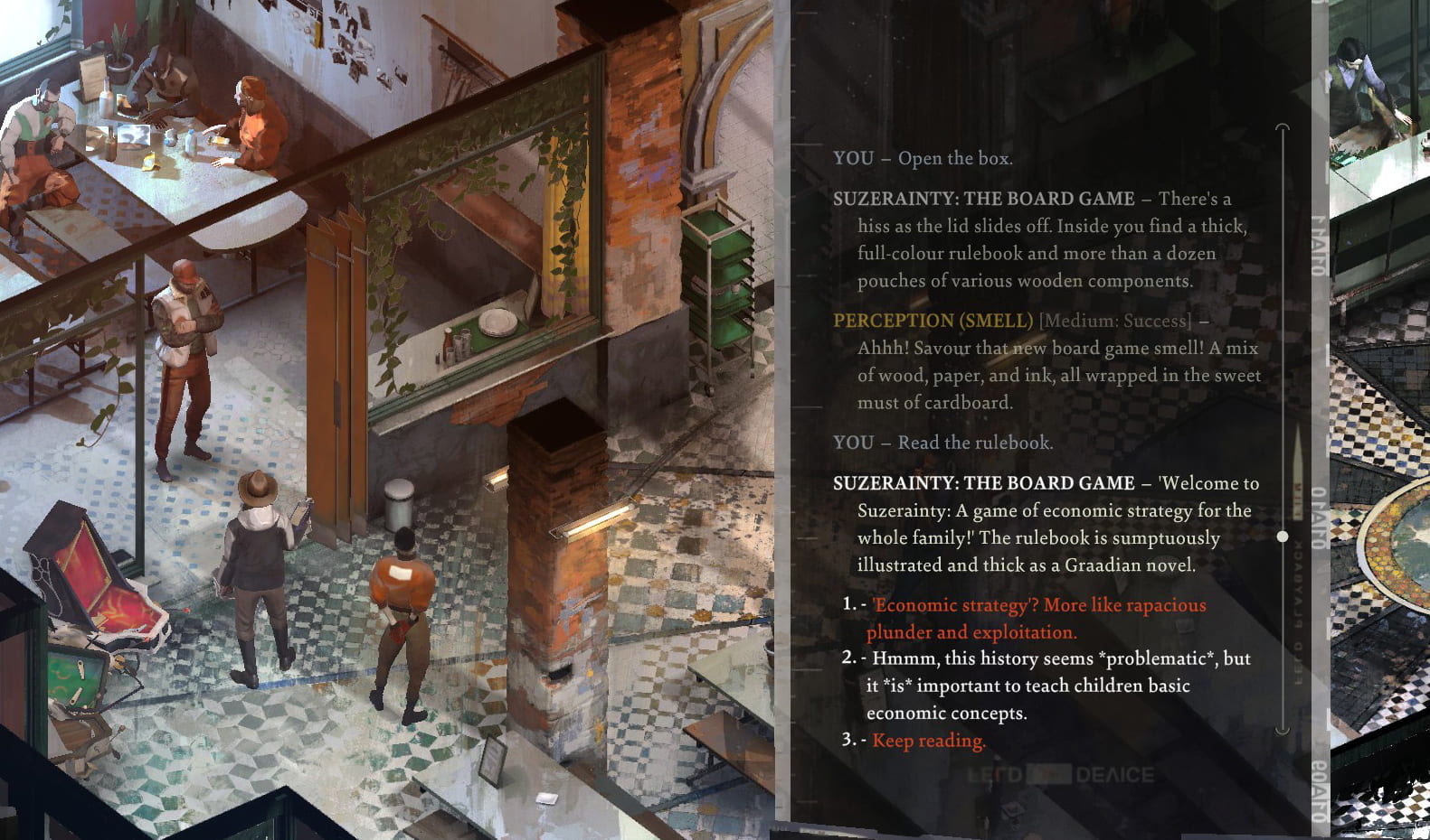
C: For my translation I ended up looking to interactive fiction and text-based video games like Papers, Please and Disco Elysium for inspiration. At the same time, I didn’t want to imply that forms are game-like. These are real issues with lots at stake: banks refuse to open accounts for those whose names appear in different orders on different documents; families are questioned at immigration counters; scholars lose out on attribution because of inflexible citation practices; students end up with degree certificates which do not bear their actual names. So including text stories and audio snippets from participants was a way to remind users, especially those who’ve never had to think about this problem, that names and naming infrastructures matter.
I’m a big fan of how games tell personal and societal stories in interactive ways. Disco Elysium completely changed how I think about how I think, and how to represent social interactions. The game renders neoliberalism and the spectre of communism visible by telescoping between conversations inside the player’s head, to current events taking place in a few city blocks, to the histories of colonial nations spanning hundreds of years. The writing is brilliant; the various voices go from witty to dryly detached to gut-wrenchingly mournful. That’s something I emulated in the tone of writing in my webpage: slightly lyrical, poetic, conversational, not hiding behind the guise of distanced neutrality.

D: Your work required a degree of technical proficiency. Was it challenging to translate your research into a website? One could argue that coding was perhaps the first translation and the website, as a visual output from code, was the second. Did the extra steps make the translation more challenging?
C: I’d say that the first translation, and the most challenging, was taking insights from my research and turning them into parts of forms. I spent a lot of time mucking around with various university application forms, trying to break them, looking at the underlying code, and then thinking about how to subvert the properties of each form element to tell the story I wanted to tell. The second translation would be taking my wireframe sketches/notes and turning those into HTML or Javascript code. Then the viewer’s specific browser and device does the work of the next translation, rendering the code into what they see and interact with.
The technical part wasn’t as difficult as the conceptual part: making sure the whole piece came together cohesively, with a clear flow and narrative—and doing all of that within two weeks.
Because of pandemic restrictions, we weren’t able to put together a physical exhibition for the module. It would have been nice to engage with visitors responding to our work in-person. Yet doing an online exhibition has its benefits—so far I’ve had over 700 visitors to my site from all over the world, something which would have been impossible with a physical exhibition. UX designers, librarians, students, writers and teachers have sent comments about the piece. How have you approached the ‘public engagement’ part of the module?
D: I conducted my research using Microsoft Teams, which provided a Covid-safe way to conduct fieldwork. However, the two-dimensional nature of the video interview was restrictive and visually flat. In conjunction with Teams, I used PowerPoint and still images to invoke memory. The data was interesting, yet I knew my translation had to work hard to be engaging. Whilst I had used visual research methods, I felt they could not stand alone or complement my final translation.
Your website is text-based and requires one to lean into the experience and concentrate. Was that a conscious choice; an element of your engagement strategy? Did you feel it would help it cut through other pieces in the exhibition that provided a lean-out experience?
C: Yes, it was a decision I made after seeing artworks in museums where the viewer does most of the work of construing by looking and thinking. They don’t physically interact with the piece, their actions don’t change the piece. Whereas filling in a form requires action: writing with a pen or pencil, typing on a keyboard, pressing buttons, stamping. So it would be odd to speak about forms without that active element.
Asking someone to think about filling out a form is not filling out a form. Neither is watching someone fill out a form. Nor is reading or listening to someone’s account of their difficulties filling out a form. I wanted to convey the sense of anxiety, of frustration at helplessness, which the participants and myself feel when we’re filling forms that have not been designed for names like ours. My strategy was to make the user go through a similar experience and supplement it with narratives from participants which guided them. Having the user control movement through the webpage is also a strategy to stagger the presentation of information, making it less overwhelming.
Let’s talk about how undertaking the MA influences how we make work and do research now. What lessons have you taken away from the SRPE module and our course in general? What’s next for your work?
D: Before the course, I was thinking about still images through a documentary lens. I had made the connection between research and image-making, yet I perceived both types of work to be very distinct. Today, I find myself blurring the lines between the two. Most importantly, the interdisciplinary nature of the course has pushed me to become more conceptual and receptive to ideas from interrelated fields. That’s not to say that I wasn’t before. This course has just sharpened my attentiveness and comprehension. My to-read list now contains books about sound, decolonisation, class, gestaltism and object-oriented ontologies.
My visual practice has also moved on. I’m thinking about moving images. Additionally, I’ve stepped back from the 3:2 rectangle to assess the affordances of all formats of still images – even those that do not seem obvious. In some respects, I’ve moved on; in others I’m starting again, which is good.
You came to the course as a well-established illustrator with a focus on social issues. How has the MA changed your relationship with illustration? You are very devoted to the craft of drawing; technical and aesthetic perfection. Has the MA shifted your attention toward ideas, concepts and research? Has your practice expanded?
C: I’m a biochemist and teacher by training; I can’t compete on a technical level with illustration majors who’ve had years to practice. So I’ve prioritised thoughtful visual storytelling—narrative over technical perfection, issues over style—even if I also believe proficiency in a medium and form is important. Just like you, I’ve been pushed in the MA to attend to the conceptual side of things more. I’ve started thinking about incorporating audio into my work. I am also unlearning the need to polish what I produce (a very commercial illustrator-y trait) and be okay with mess, to think of mess in research as productive.
The MA has actually strengthened my resolve to keep working in illustration and comics. Illustrators obviously do more than just “depict” text; comic artists have long experimented with form and combining media, including sound and animation; both groups are extremely attuned to ways of speaking to different publics. They are perhaps less concerned with explaining what they are doing in words, despite having well-developed processes, while that explanatory work is important for sociology and for other artists. But I see a lot of room for incorporating these processes into research methodologies and outputs.
Finally, a lot of what we learned feeds directly into what I do as an editor. I work with artists to translate research articles into compelling visuals that communicate and expand on the key ideas or emotions. It’s something I’m keen to keep doing in the future.

